Many printing companies often encounter customers saying that the colors are not accurate, but the printing factory has said that it has done its best. Where is the problem? Especially now that computers are well-developed, designers can use their colors in their palms to play two 229 keys of the "Graphic Arts," and they can set two colors. These types of jobs were formerly more professional. The problem lies in the hands of different workers. The question is whether they have enough printing knowledge, what ink systems, paper properties, dot gain, color separation settings such as total ink volume, UCR, GCR, UCA, etc. Which is more often encountered is a spot color and four colors. All of the above problems will have the opportunity to make the colors inaccurate. With this in mind, the author hopes to share some experiences with you in the following sections.
Printing ink classification
The inks specified in the desktop design software are divided into two major categories, Spot Color Ink and Process Color Ink. Let's take a look at four-color inks. There are three systems of four-color inks used in the current world, including: Japan Standard, American Standard (Swop Standard) and European Standard (Europe Standard). The three ink colors are based on people in different regions have different preferences for color perception. Ink in Asia is dominated by Japan, which is usually brighter and the colors are exaggerated, while the ink colors in Europe and America are more natural. For spot color inks, there are several sets of standards, such as Pantone, DIC and Toyo Ink, which are subdivided into general spot colors, fluorescent colors, and metallic colors. The color designation has four colors and spot colors, so the designer should depend on which type of ink is used for the final printing. Which set of ink color is used to specify, or else the good may not be expected.
Four-color and spot color ink color matching system
Most typesetting and drawing software allows you to use both spot colors and four colors in the same manuscript. It also provides an option that allows you to select spot color printing or convert spot colors to the closest four-color dots. Why use four colors and spot colors on the same print? The most common reason is to include a photo while still matching the exact company color, for example, for those used as company logos or product packaging.
Spot color printing is available when there are only one or two colors on the page. Moreover, spot color printing is based on different color requirements with a spot color ink. Some spot color inks contain colors that cannot be obtained with four primary colors, such as silver, gold, fluorescent colors, and some bright colors. Spot colors are often used in places where the accuracy of printing colors is high, such as company logos, packaging, and greeting cards.
Four-primary printing is based on a certain proportion of three primary colors: Cyan, Magenta, Yellow, and Black inks are printed on paper to produce various colors. When there are more than three colors on the page, printing with four primary colors is the most appropriate, and copying of full-color images with four-color printing is essential.
Due to different needs, there are different color matching system choices in most of the software. The most common ones are Pantone, Trumatch, Focoltone, DIC and Toyo. They are applicable to different countries and regions, and they are also divided into spot color series. And four-color series. Therefore, when designing a color match, please use the series of ink systems according to the printing process to select the color matching system. And to buy a color sample of the selected color matching system as a reference, because the colors seen on the screen, there may be some differences. Since Pantone is more popular in the market, the following color matching system will be introduced first.
PANTONE spot color
Pantone is a color matching system developed by an American company. The English full name is Pantone Matching System, or PMS for short. First introduced his spot color system, which is based on three color samples (PANTONE formula guide solid coated, PANTONE formula guide solid uncoated, PANTONE formula guide solid matte), which are used in powdered paper, book paper and matte paper, with 14 kinds of color samples. Basic ink synthesis, dubbed 1114 spot colors.
Many ink manufacturers and software manufacturers claim that their products follow the Pantone color standard, which means that designers can use desktop software to create, and feel relieved to know that even if colors and color samples on the screen display sample color may not be accurate Match, but if printed with the appropriate spot color ink, the color on the print will be quite close to the desired color. If you use PANTONE's spot color system for color matching, there will be a lot of color problems when converting to four-color printing, because only about 50% of Pantone spot color combinations can be simulated by CMYK, and some colors are deviated. very far.
To get accurate colors, the designer is better off owning a book named PANTONE solid to process. Next to each spot color is the closest color sample that can be generated with the four primary colors. This color sample is for designers. It is very important because it actually shows that many spot colors are difficult or impossible to synthesize with CMYK four colors.
PANTONE four colors
In addition to the well-known spot color system, PANTONE has also introduced two CMYK-based color specification systems, PANTONE process coated SWOP and PANTONE process uncoated SWOP, which specify more than 3000 colors according to the color ratio of CMYK. All colors are based on the color produced by the SWOP four-color ink.
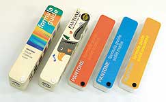
The PANTONE formula guide, on the left, is the 95th edition of the United States, the second on the left is the 95th European edition, and the third on the right is the 2000 edition.
PANTONE Process guide, left 2000, right 95 European edition.
PANTONE Hexachrome Color Selector, the left is the powder paper, the middle is the book paper (non-coated paper), the right is the Hexachrome six-color simulated spot color office, called Solid in hexachrome.
The four-color and spot color contrast PANTONE color office, the left is published in 1995, named PANTONE Process Color Imaging Guide 1000, right is the 2000 edition, named PANTONE solid to process.
PANTONE six colors
PANTONE Hexachrome is a color matching system designed for high-fidelity color Hi-Fi Color in recent years. Its main combination is the color that can be produced by adding four colors: spot color orange and spot color green. The matching of PANTONE spot colors enables the effect that many spot colors can be used to achieve in the past. Now it is possible to use a combination of six colors.
PANTONE color printing parameters for different years
Why is the dot data provided by the PANTONE color in the software applied? There are still large deviations in printing. The answer has two possibilities. (1) This color leaves the color gamut range of the four-color printing, and (2) is this set of data. This is not consistent with the printing conditions used. This is due to the fact that PANTONE uses the color of the four colors they printed to be the closest to this spot color.
The above was published in 1995, named PANTONE Process Color Imaging Guide 1000, and the following is the 2000 edition named PANTONE solid to process.
PANTONE color printing parameters for different years, the right is the 95th edition, the left is the 2000 edition.
PANTONE Orange 021 this spot color four-color dot value, the picture is Adobe Illustrator 8.0, M51 + Y87, the picture below is Adobe Illustrator 10, M53 + Y100, because the former uses the 95 version of the data while the latter uses the 2000 version of the data.
I do not know if you have noticed that different software versions have different values. It was originally that the paper used by PANTONE Color Office before 2000 was relatively yellow. After the customers reported that they used a newer version of paper in 2000, it affected four colors. The simulated values ​​are compared in the figure below.
How to get the best color matching
What value is used to get the closest effect? There are two ways to do this: (a) Find the closest color block in the four-color color table with the selected color ticket, record the value, and apply it to the software.
Wine Rack,Wine Holder,Wire Wine Rack
Display Rack,Capacitor Co., Ltd. , http://www.nsdisplayrack.com